Bumble Events
Bumble is a dating and social networking app that empowers people to connect with confidence—whether they’re looking for love, friendship, or professional networking. In this project, I designed a new feature Bumble Events: a real-time social discovery feature that helps users connect with people who are already at the same event or venue. Whether you're at a music festival, networking event, or local meetup, Bumble Events allows you to check in, discover nearby attendees, and match with like-minded people in real life.
Duration
4 weeks, Spring 2025
Individual
Class Project
Role
UI/UX Design
Design Systems
Prototyping

Figma
Tools
“Instead of just telling users that someone is nearby, what if Bumble helped them actually connect—at the places they’re already showing up to meet people, discover things, or be social?”
I was given a design brief from Bumble that focused on increasing premium subscriptions by leveraging precise location notifications. The idea was to notify users—on mobile, desktop, and watch—when a potential match was within 0.5 kilometers, using enhanced location services.
The assumption behind this feature was simple: if users knew someone attractive or interesting was physically nearby, they’d be more motivated to engage—and potentially subscribe to unlock that information.
But what was missing from the brief was a clear plan for how this interaction would unfold, what value it created for users beyond the initial alert, and why it would feel meaningful, rather than invasive.
The Challenge
While the goal of increasing conversions made sense, I quickly noticed that the solution proposed in the brief had major gaps:
Privacy Concerns → Users may not want their exact location exposed.
Lack of Context → A notification alone doesn’t facilitate a meaningful connection.
Passive Experience → Users are not actively engaging with the feature—just receiving alerts.
If I had simply followed the brief, I might have designed a pop-up or alert—one that looked nice but lacked depth, failed to build lasting engagement.
The Original Design Brief
What I Found Problematic
How I Reframed the Problem
So I asked a bigger question:
That’s how Bumble Events came to life.
I shifted the focus from notifications about proximity to real-time, event-based social discovery.
From Location Alerts → To Real-Time Event-Based Connections
From Passive Swiping → To In-Person Social Discovery
From Just Notifications → To Full-Fledged Event Navigation & Meetups
Goals
Enhance real-time social discovery in meaningful spaces
Encourage premium subscription upgrades through exclusive feature access
Reinforce Bumble’s commitment to kind, intentional connections
Research
Design Process
I analyzed data from Bumble’s previously sunsetted features—Proximity Alert and Map Integration for Nearby Events. The findings revealed key insights:
Both adoption declined quickly after launch, even though the feature initially drew attention.
Among the two features, Proximity Alert and Map Integration for Nearby Events, second one was more successful, showing people’s interests in the concept of connecting people in “events”.


Data Insights
How I Addressed These Issues
Insight: Adoption rates dropped as the novelty wore off.
Design Response: Bumble Events focuses on real-time, purpose-driven interactions (connecting at live events) rather than passive map browsing.
I mapped out a complete user flow to support real-life meetups through the Bumble app, all while maintaining user control and safety.

User Flow
Insight: Location-based map features alone did not sustain engagement.
Design Response: Bumble Events prioritizes event-based interactions to create a social context for connections, making meetups more natural and engaging. Features like check-ins, real-time matching, and navigation tools encourage users to actively participate.
I created low-fidelity wireframes to map out the overall structure and user flow of Bumble Events across mobile, desktop, and watch platforms. This helped me quickly explore interaction patterns, screen transitions, and content hierarchy before committing to visual design decisions.
The final design for Bumble Events introduces a complete end-to-end experience that lets users discover, check into, and connect with others at live events—all while preserving Bumble’s tone, brand identity, and design consistency.
To support this new experience, I created a tailored design system extension—drawing from Google’s Material 3 UI components, then adapting them to match Bumble’s visual identity and support the unique interactions of this feature.
Low-Fidelity Wireframes

Once I transitioned to high-fidelity, the focus shifted to making sure every component fit Bumble’s visual language and behavior patterns.
Revisiting Layout: From Carousel to Swipeable Event Cards
In early high-fidelity drafts, I explored a carousel-style layout for the Events page. While it looked dynamic, it didn't feel quite Bumble. The carousel introduced horizontal scrolls and gesture patterns that deviated from Bumble’s core swipe-based behavior.
To stay true to Bumble’s design logic, I replaced the carousel with a vertically stacked list of swipeable event cards, mirroring the familiar swipe UI of Bumble’s existing match experience.
High-Fidelity Design: Integrating With the Bumble Design System
Final Outcome
Design System
Bumble Events is a new feature that brings Bumble’s mission of meaningful connection into the real world—by helping users discover and connect with others who are already at the same event or venue.
Whether you’re attending a music festival, a coffee meetup, or a professional networking event, Bumble Events creates the opportunity to match in real time, engage purposefully, and meet safely—all within the Bumble app.
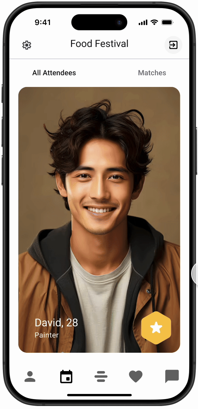
Once checked in, users can see and swipe through others who are also at the event.
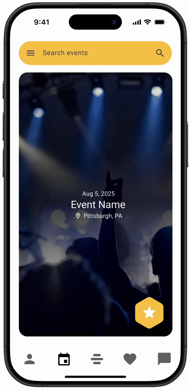
Event Discovery & Check-In
Users can discover events through swiping, similar to how they swipe on profiles. Users can tap into a card to view full event details and check in if they’re attending. There is privacy setting that allows users to choose if they want to share their specific locations with other participants in this event.

“Meet Here” Coordination Tool
Meeting someone in a crowded venue can be difficult—especially without clear directions. Bumble Events makes it easier with a shared meeting point and real-time movement guidance.
“Meet Here” Pin – After matching, users can drop a pin anywhere within the venue. Both users agree on the spot and receive directions.
Live Status Updates – Each user sees friendly updates like “David is 2 mins away” or “You’re almost there!” as they approach the meeting point.


Introducing Bumble Events
In-Event Discovery & Matching

Signal Flare
The Signal Flare feature allows users to send a quick, friendly notification when they’re nearby.
Apple Watch
Desktop
Insight: Retention rates declined after initial curiosity faded.
Design Response: The temporary nature of events creates urgency. Users are motivated to check in and engage because the opportunity is fleeting, which helps maintain activity.


Bumble Events was designed with multi-platform usability in mind, ensuring a cohesive and intuitive experience across iOS, Android, desktop, and Apple Watch.

Designing Bumble Events challenged me to think beyond features and focus on what makes connection meaningful in real life. What started as a location-based notification request evolved into a full-fledged, real-time experience built around intention, privacy, and presence.
One of my biggest takeaways was the value of reframing a brief. Instead of accepting the problem as given, I questioned the assumptions, looked at past failures, and explored what people actually want when they’re open to meeting someone in person. That shift allowed me to design not just for engagement, but for genuine human moments.
This project also deepened my understanding of design systems. Building from Material 3 gave me structure, but adapting those components to reflect Bumble’s unique tone and interaction model taught me how systems can be both flexible and expressive.