JF Books Rebrand
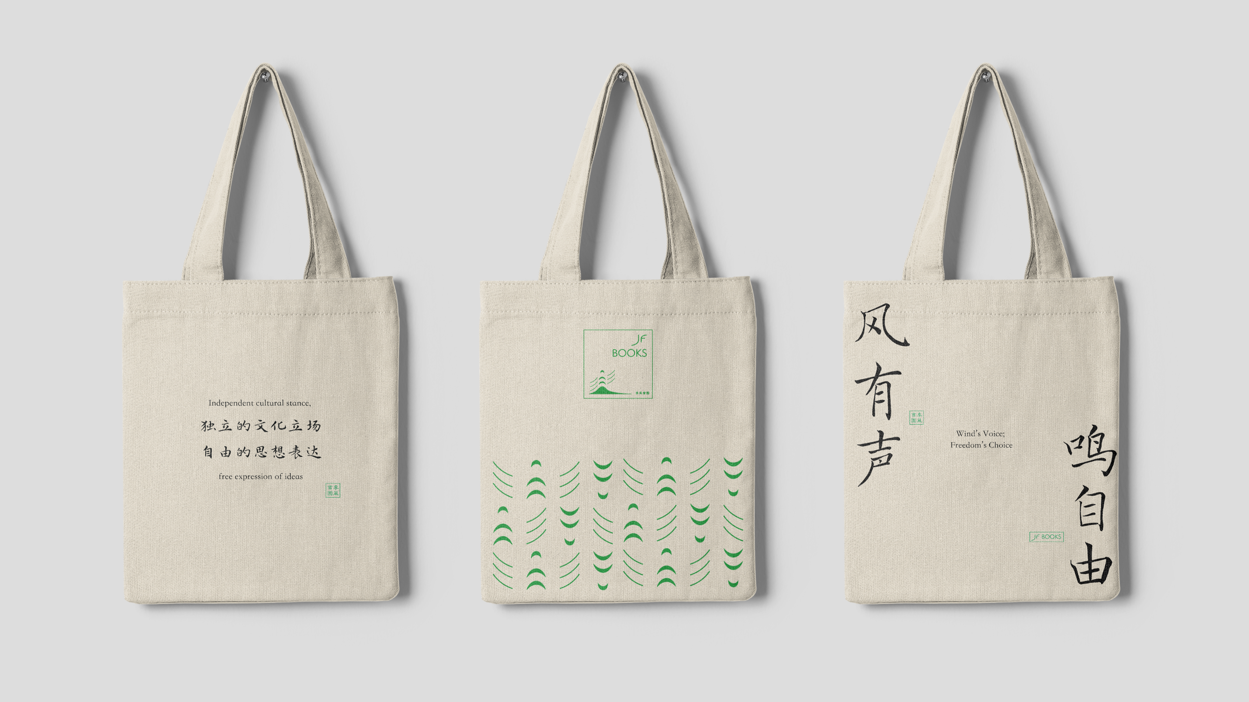
In 1997, Jifeng Bookstore, an independent bookstore with the motto of “independent cultural stance and free expression of ideas”, opened in Shanghai, China, and after two decades of development, it had eight branches in Shanghai at its peak. However, it was forced to close in 2018 due to pressure from the Chinese government.
Today, Jifeng Bookstore finds a new home in Washington D.C. with a new name, JF Books. This rebranding project reflects its revival and a continuation of its legacy.
Duration
5 months, Spring 2024 - Summer 2024
Individual
Client: Jifeng Book Inc.
Role
Brand Design, VI System

Adobe Illustrator Figma
Adobe Photoshop
Tools
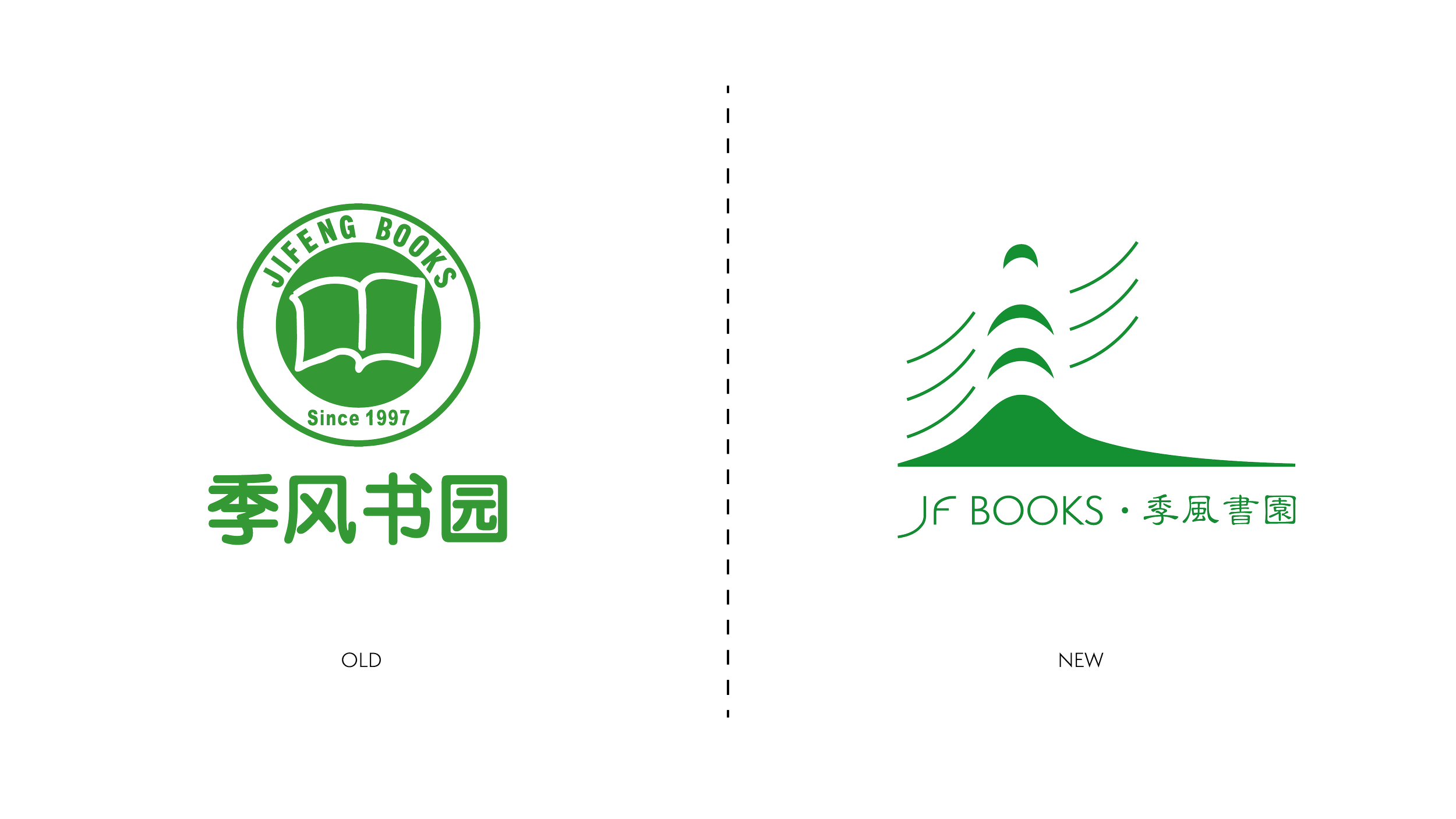
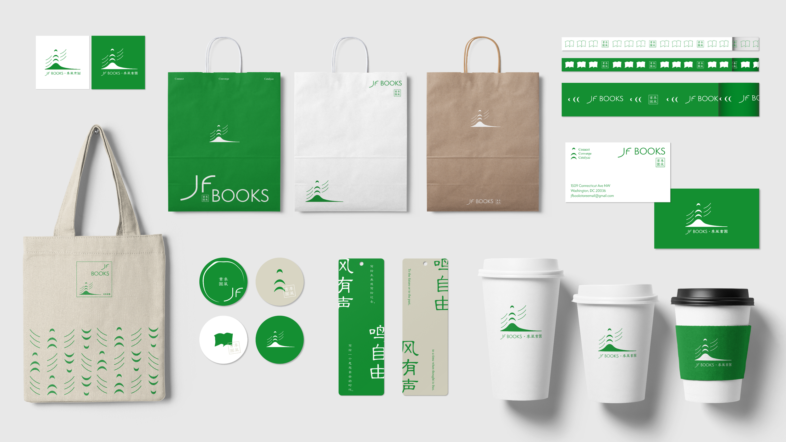
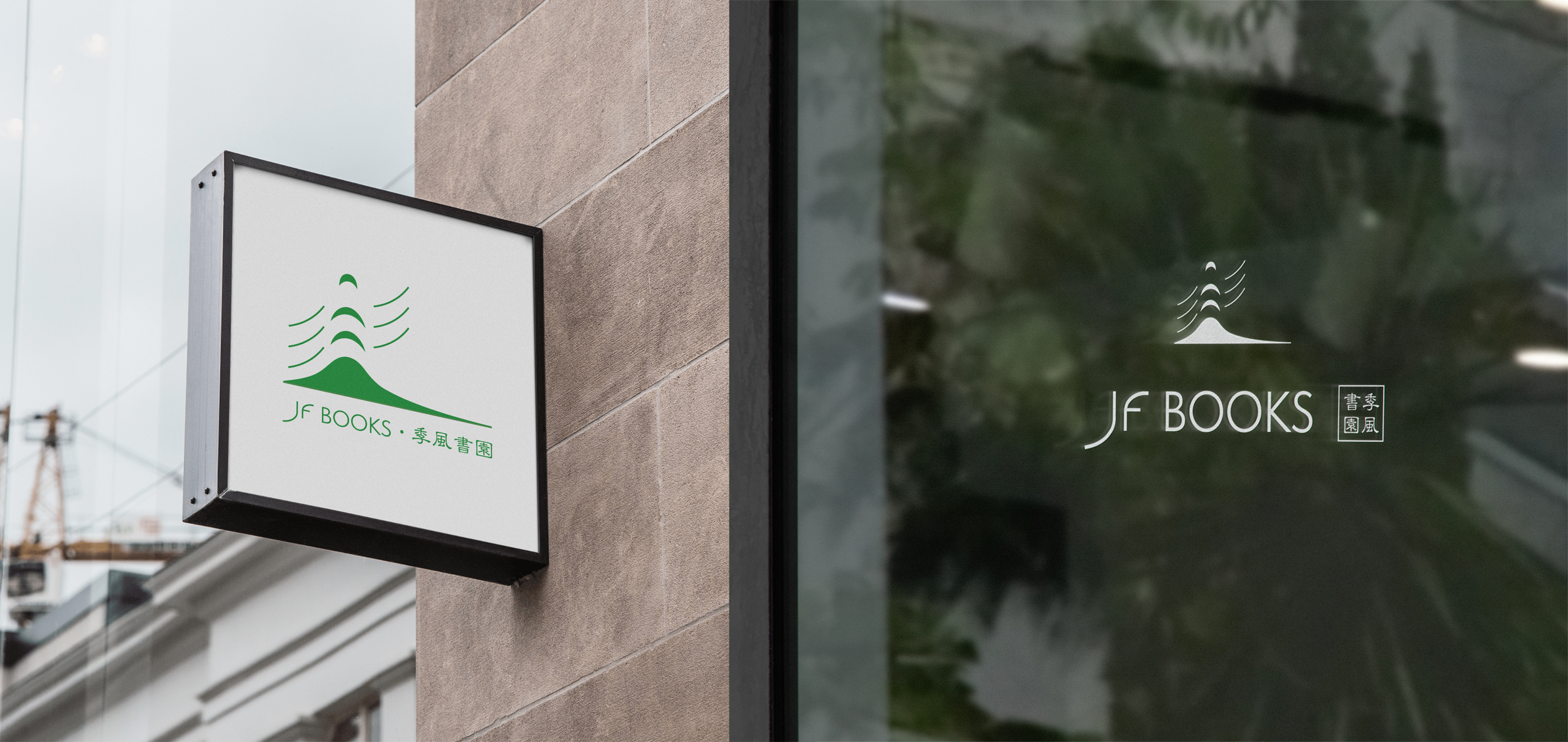
The rebranding project is symbolized by the logo renovation. The old logo, featuring a traditional design, has been replaced with one that presents a more contemporary and dynamic visual identity.
Logo Renovation
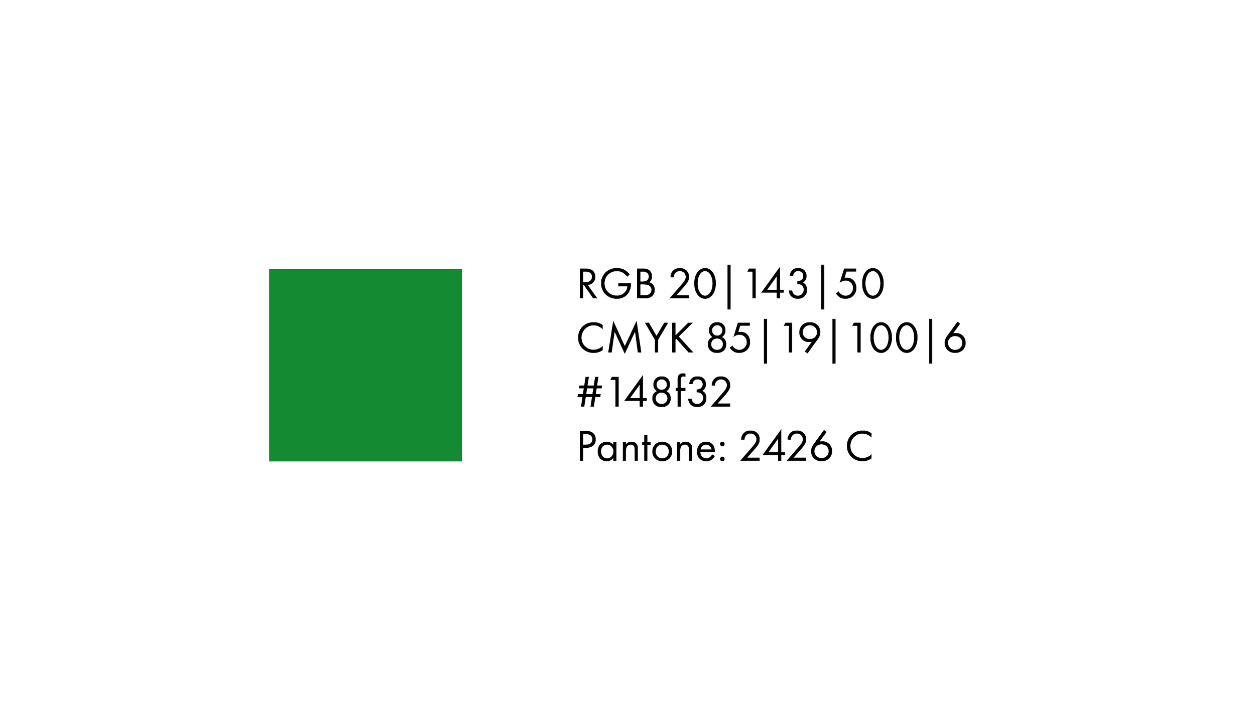
The familiar green color scheme has been retained and consolidated by setting specific RGB, CMYK, HEX, and Pantone color values, emphasizing continuity and brand recognition. The typeface includes both English ("JF BOOKS") and Chinese ("季风书园"), ensuring clear communication with both English-speaking and Chinese-speaking customers. The updated English typography is sleek and modern, enhancing the overall aesthetic appeal, while the Chinese typography retains a touch of traditional calligraphy, conveying the bookstore's roots and cultural heritage.
Color & Text

The new logo encapsulates the bookstore's mission and vision through three key graphic elements: wind, lighthouse, and oasis.
The wind, representing "季风" (monsoon) in English, signifies the flow of ideas and knowledge, reflecting the dynamic environment where intellectual resources are gathered and exchanged. The lighthouse symbolizes guidance and enlightenment, highlighting the bookstore’s role in inspiring action and serving as a catalyst for social transformation in China. The oasis element signifies a place of refuge and nourishment, representing JF Books as a bright corner where individuals can connect.
By integrating these elements, the logo creates a cohesive visual narrative that emphasizes JF Bookstore’s vision of being an oasis in a dispersed era—a luminous corner where souls connect, minds converge, and actions catalyze.
Graphic


Additionally, the three curves in the design represent the three Cs: Connect, Converge, and Catalyze, reinforcing the bookstore's commitment to fostering connections, bringing ideas together, and inspiring positive action.